請問有什么可以幫助您?

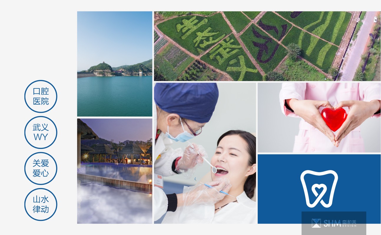
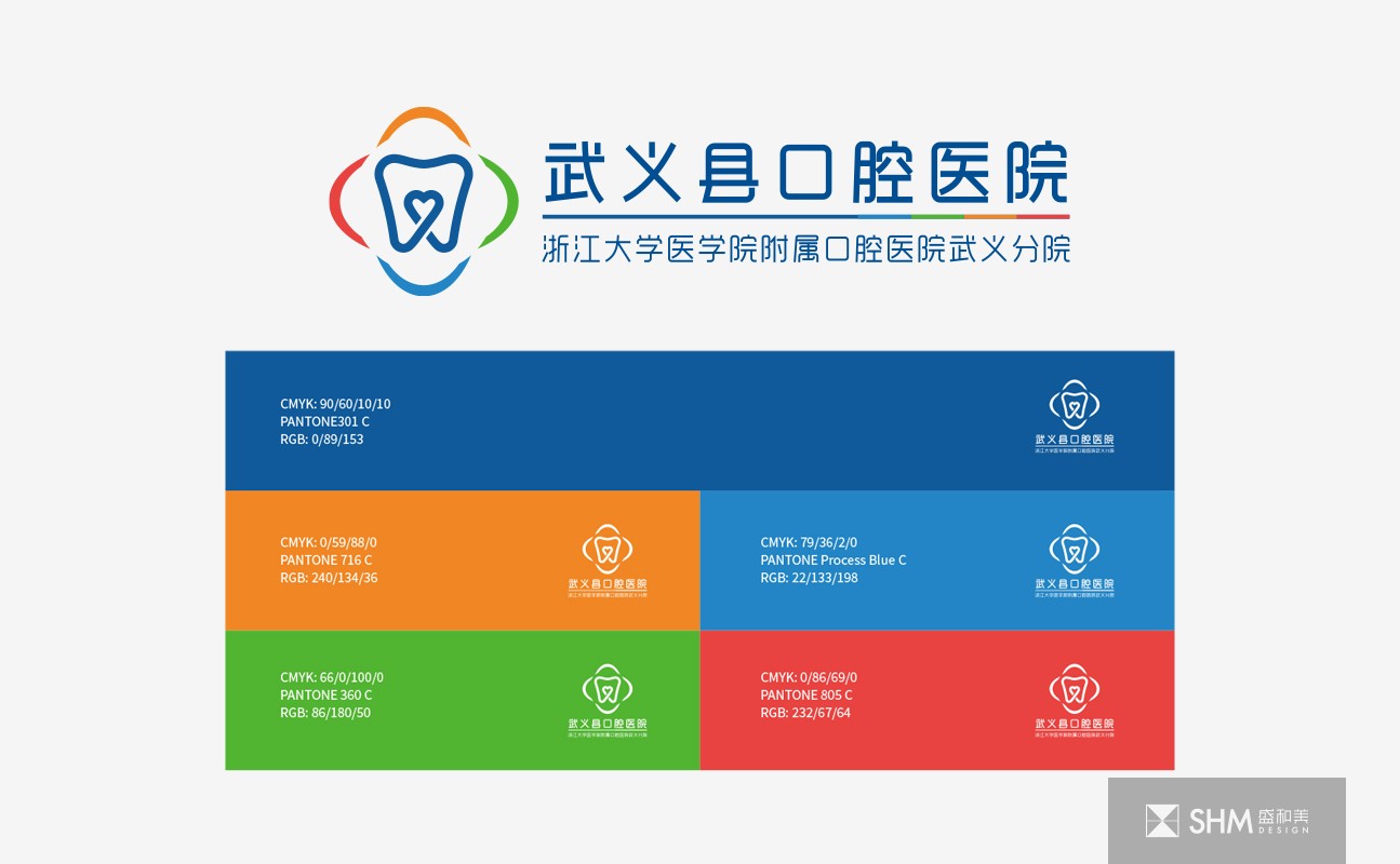
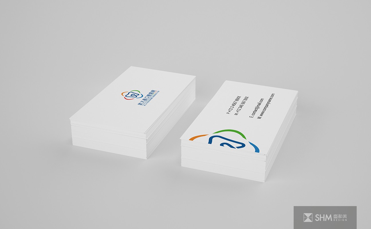
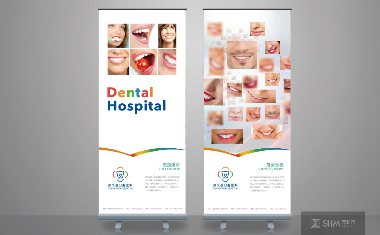
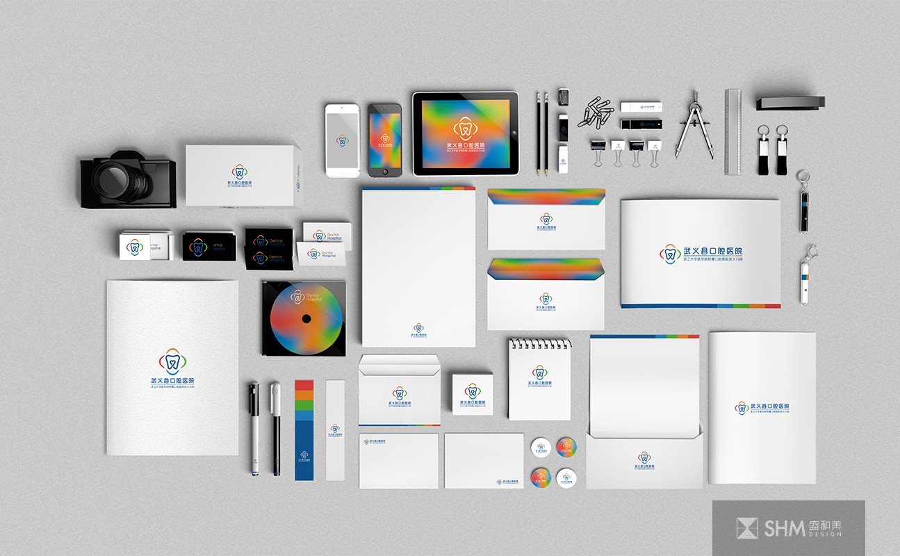
武義縣口腔醫院
Wuyi Oral Hospital
LOGO主體造型為牙齒的形狀,上方略凹,有一種山的起伏律動感,也像水波紋蕩漾,寓意人與自然的和諧共處。牙齒下方的線條交織形成一個心形,充分體現武義縣口腔醫院對就醫患者的關心愛護之情,時刻為患者著想,以人為本。牙齒整體造型與心形中又蘊含著“武義”首字母“WY”,更貼合貼合武義縣口腔醫院的地理位置與專業定位。
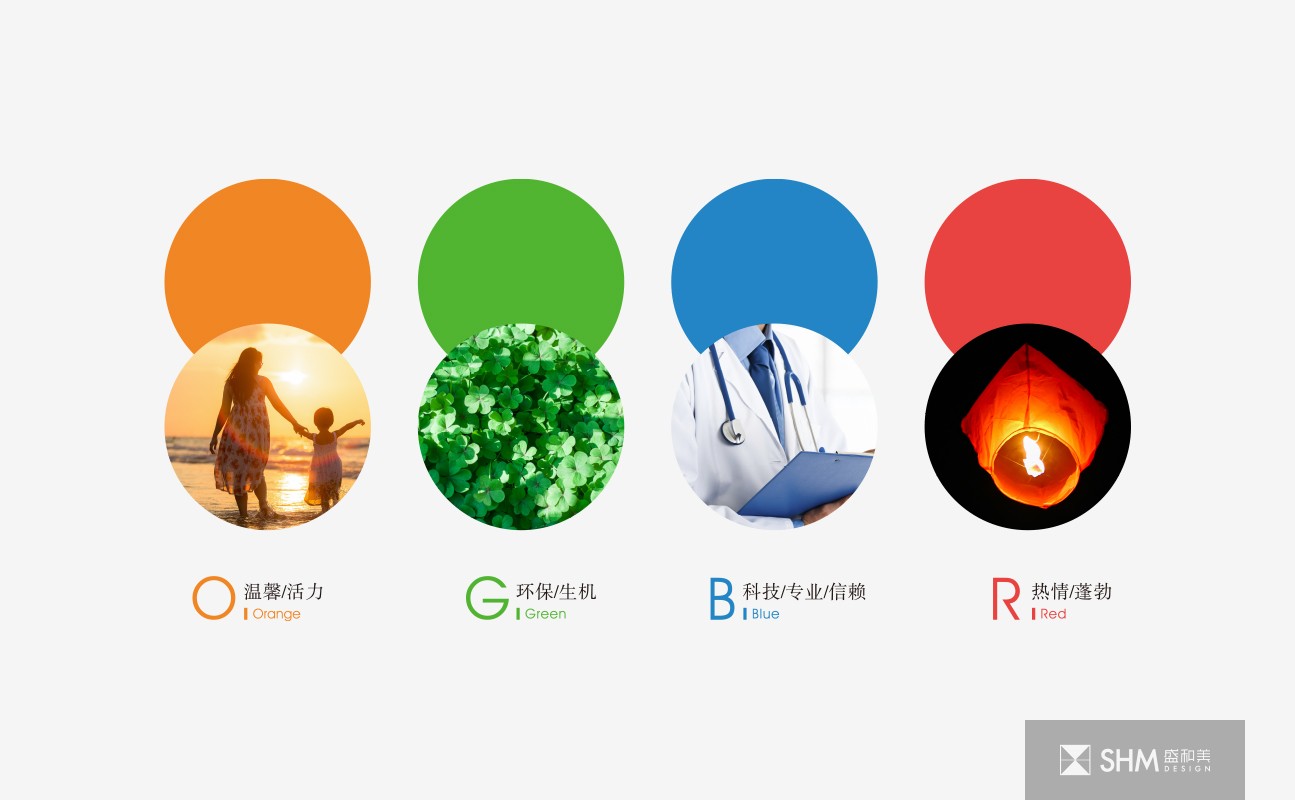
LOGO外形由四種顏色的飄帶組成一個醫院的十字形,在保留醫院經典形象的同時融入現代手法與審美。紅色代表熱情、蓬勃,橙色代表溫馨、活力,綠色代表環保、生機,藍色代表科技、專業與信賴,寓意武義口腔醫院會以專業的技術、周到的服務,為患者提供最舒適的就醫環境與體驗,讓患者口腔能重新煥發健康的活力。
The main shape of the logo is the shape of teeth. The upper part is slightly concave. There is a kind of undulating movement of mountains, which is also like the ripple of water, implying the harmonious coexistence of human and nature. The lines under the teeth interweave to form a heart shape, fully reflecting the Wuyi County Dental Hospital's care and love for the patients, always for the patients, people-oriented. The overall shape and heart shape of teeth also contain the initial "WY" of "Wuyi", which is more suitable for the geographical location and professional positioning of Wuyi dental hospital.
The logo shape is composed of four colors of streamers to form a hospital cross, which integrates modern techniques and aesthetics while retaining the classic image of the hospital. Red represents enthusiasm and vitality, orange represents warmth and vitality, green represents environmental protection and vitality, and blue represents technology, profession and trust. It means Wuyi dental hospital will provide the most comfortable medical environment and experience for patients with professional technology and thoughtful service, so that patients' oral cavity can be rejuvenated with healthy vitality.
導視標識設計 / 品牌形象設計 - 醫療系統 - 浙江金華

掃碼關注盛和美公眾平臺