請問有什么可以幫助您?

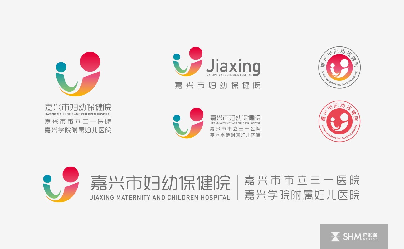
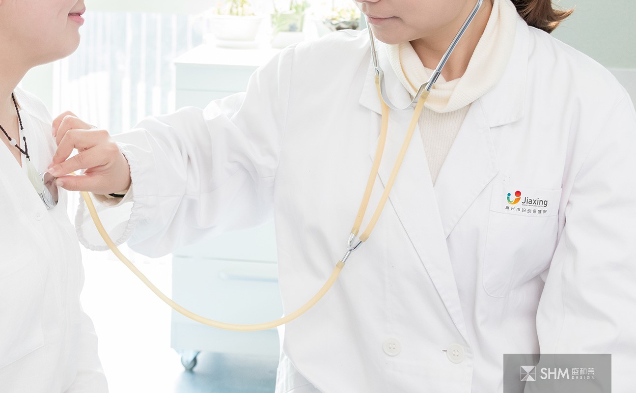
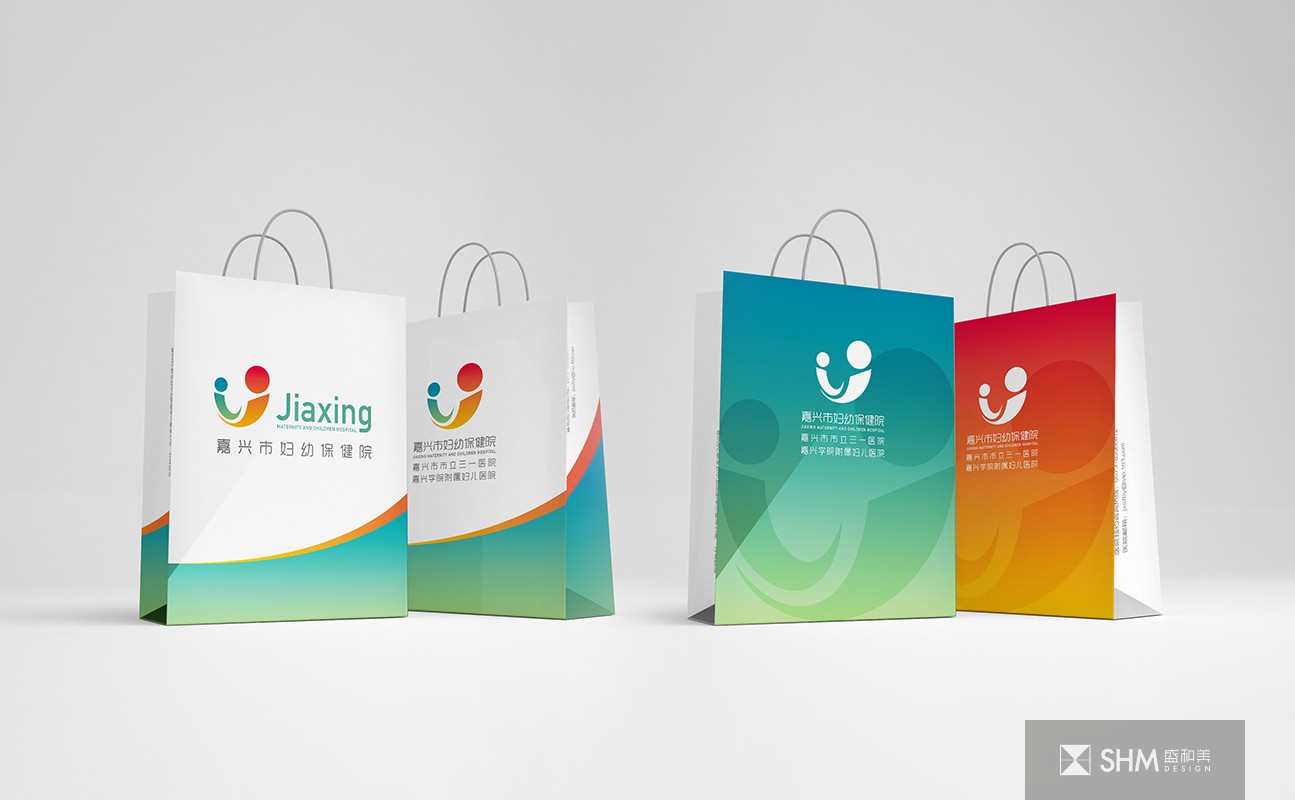
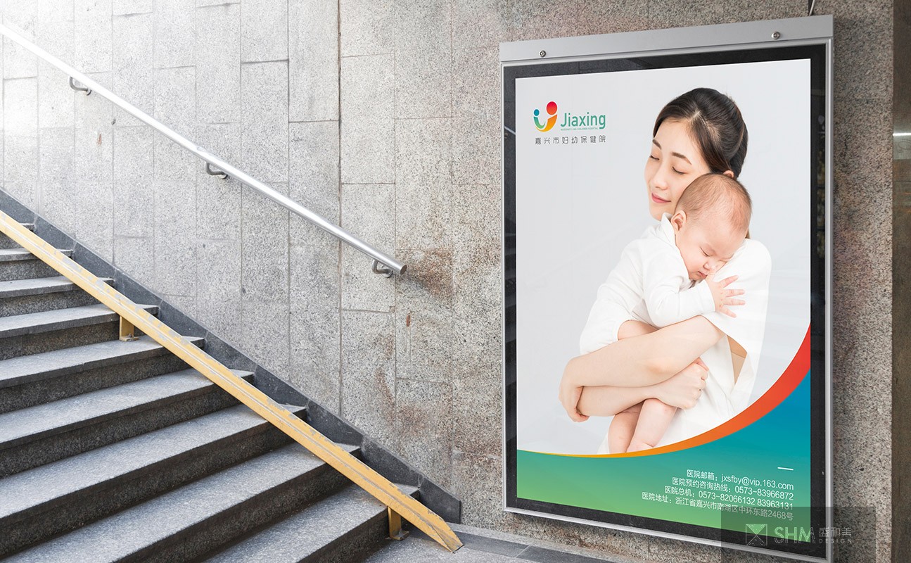
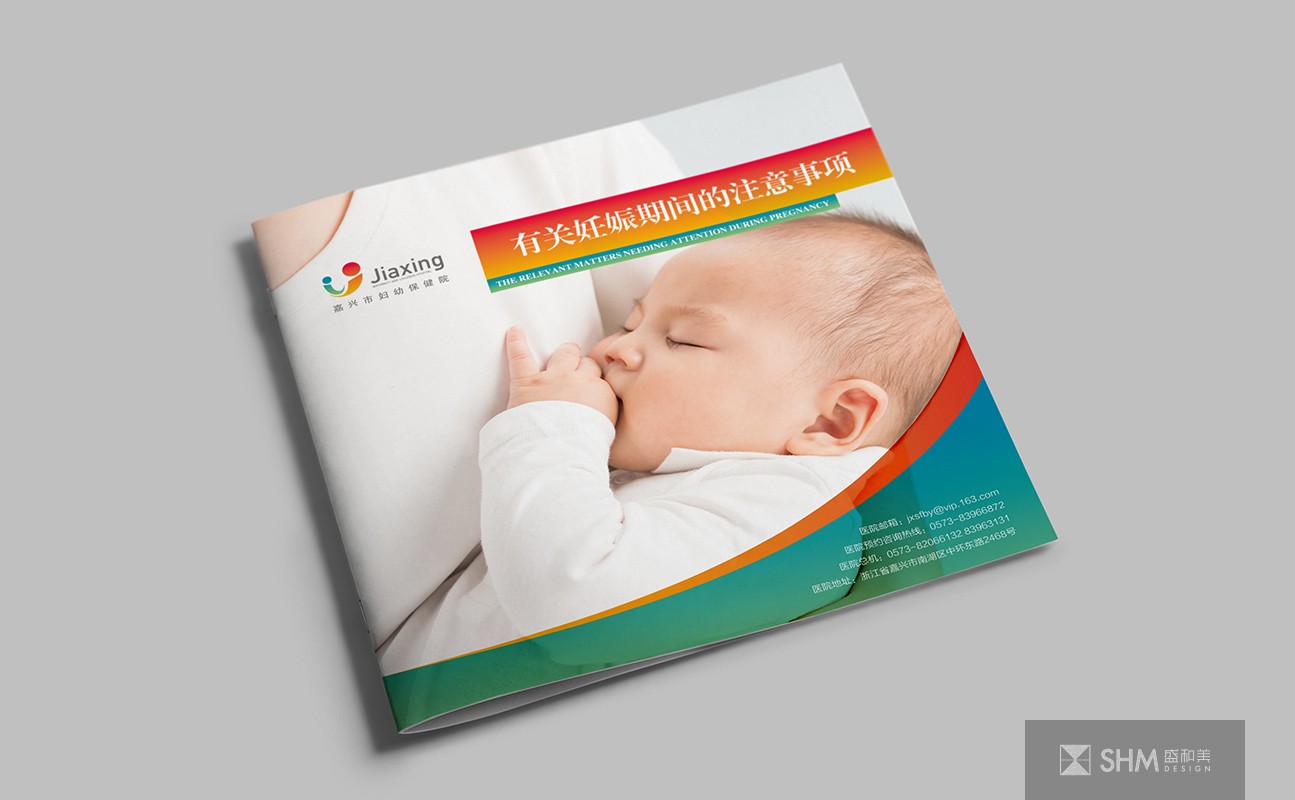
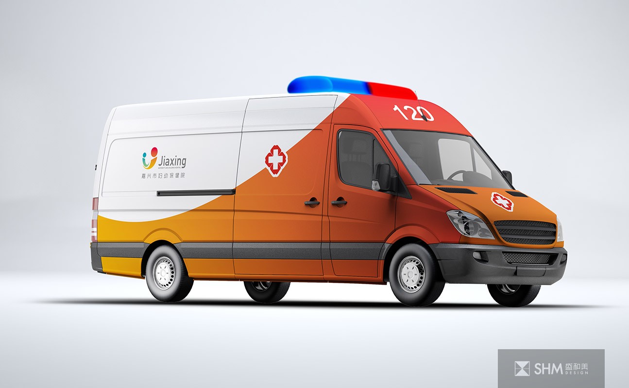
嘉興婦幼保健院
Jiaxing Maternal and Child Health Hospital
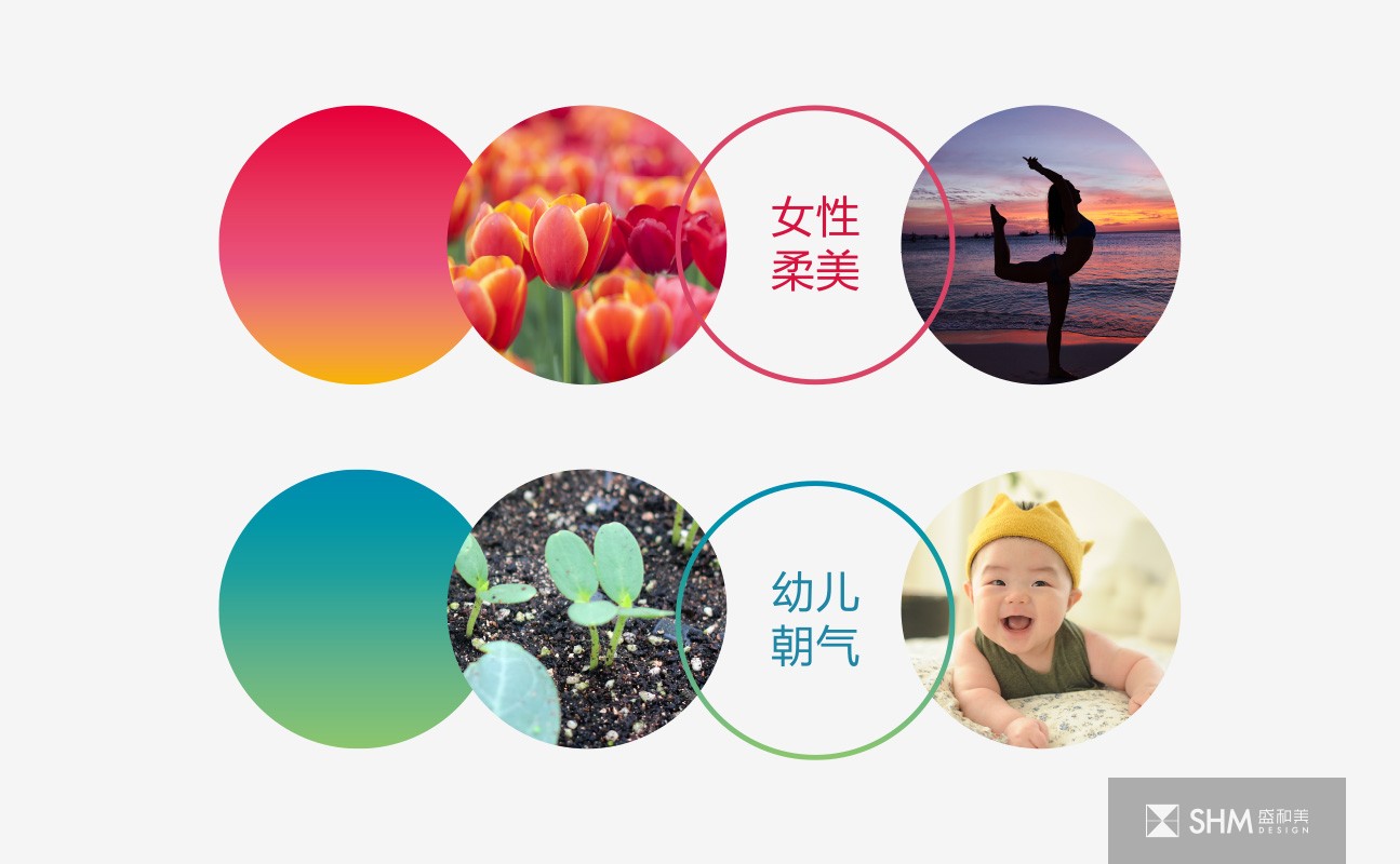
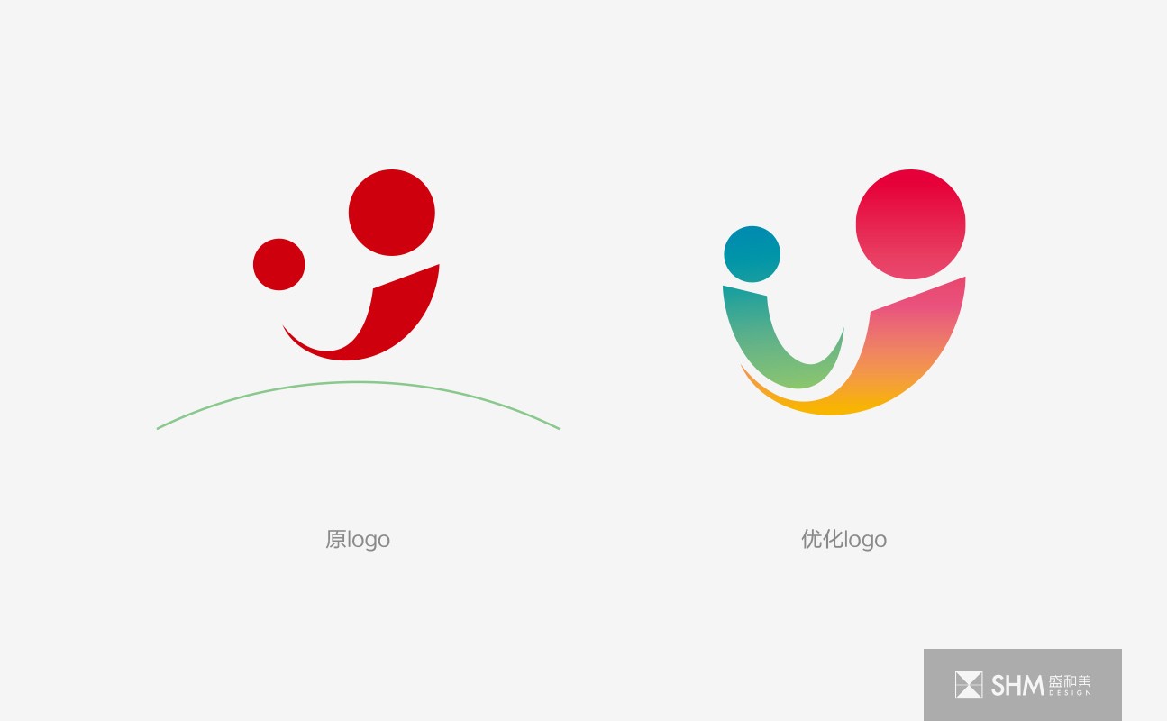
標志的優化融合了女性的柔美與幼兒的朝氣,標志整體為圓形,代表安全與圓滿,幼兒躺在女性懷中,展現著母親的關懷保護,標志整體為圓形,代表安全與圓滿,寓意院方將秉承“健康至上、務實求精、勤奮合力、科技興院”的精神,開拓進取,積極推進管理創新,重視人文理念,強化專科建設,打造婦幼品牌;從破土而出的幼苗與花朵的漸變色彩中提取得到冷暖漸變色,達到了溫馨安寧的視覺效果。
The optimization of the logo integrates the softness of women and the vitality of children. The logo is round as a whole, representing safety and completeness. Children lie in the arms of women, showing their mother's care and protection. The logo is round as a whole, representing safety and completeness. It means that the hospital will adhere to the spirit of "health first, pragmatism and refinement, diligence and joint efforts, science and technology prosper the hospital", forge ahead, and actively promote management and innovation New, pay attention to the concept of humanity, strengthen the construction of specialty, and build the brand of women and children; extract the cool and warm gradual colors from the gradual colors of seedlings and flowers from the ground breaking, so as to achieve a warm and peaceful visual effect.
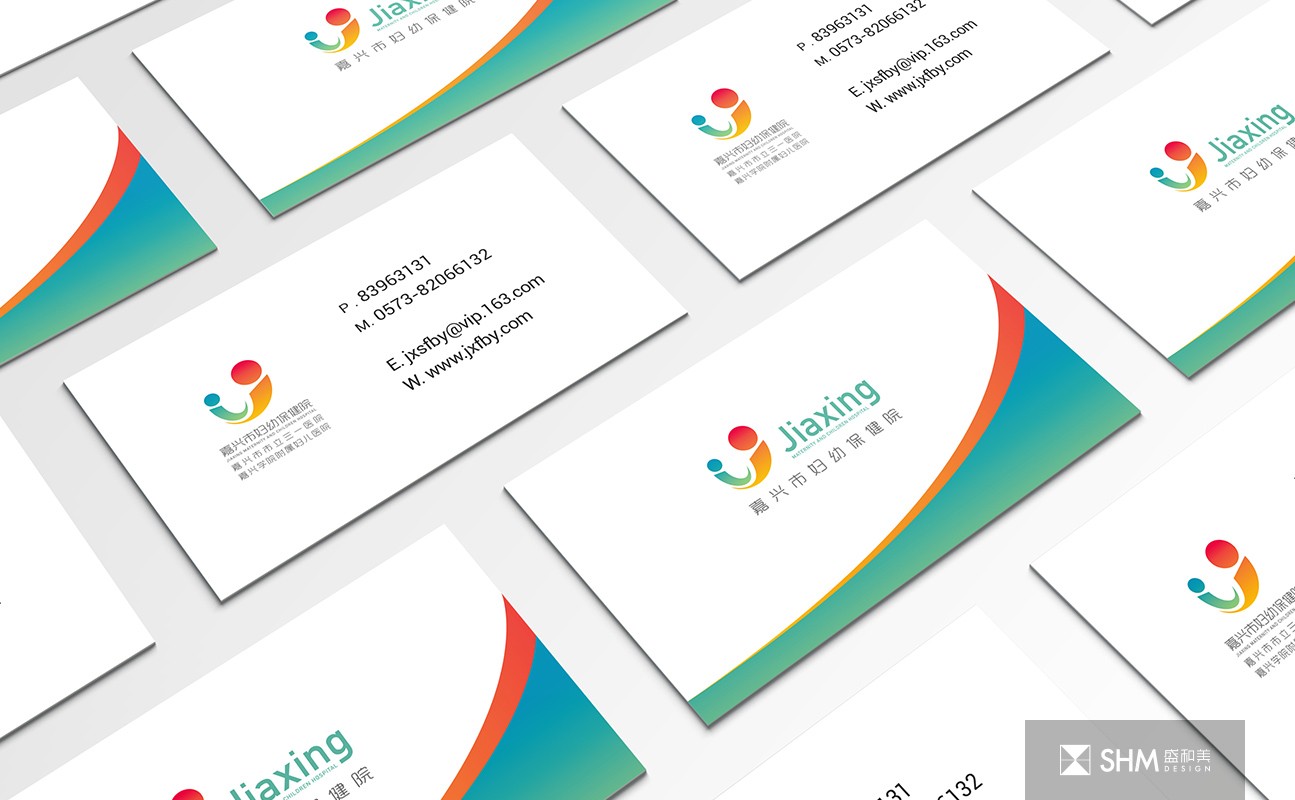
導視標識設計 / 品牌形象設計 - 醫療系統 - 浙江嘉興
掃碼關注盛和美公眾平臺