請問有什么可以幫助您?

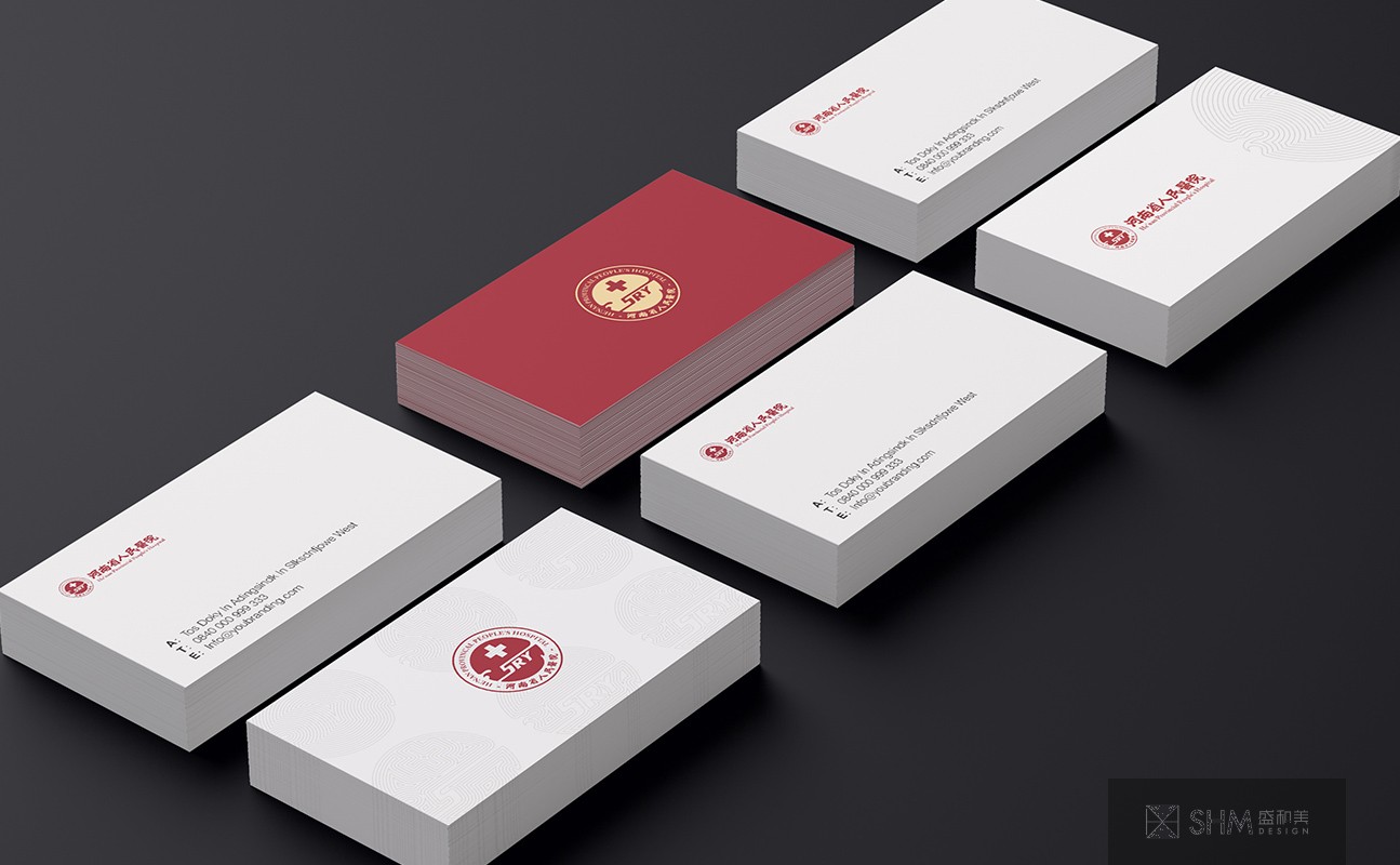
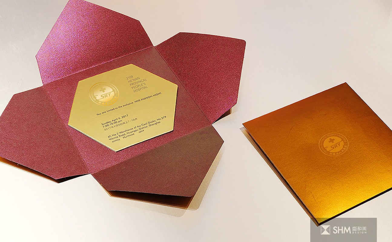
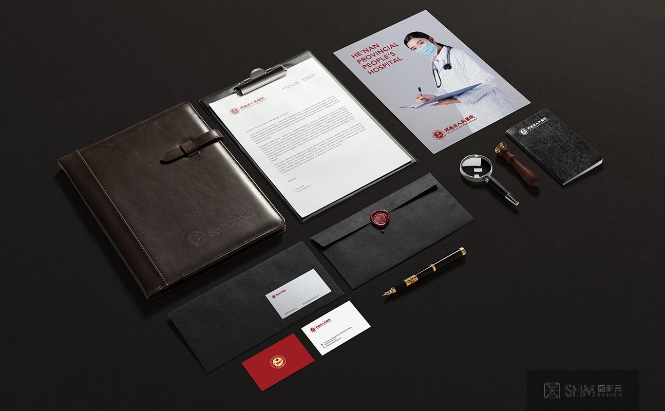
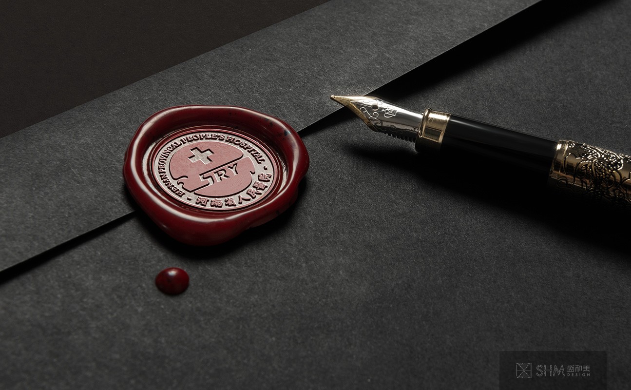
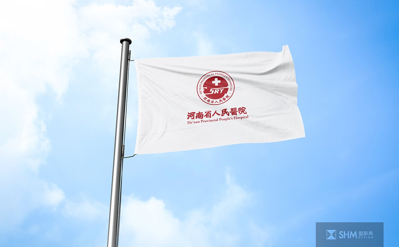
河南省人民醫院
He’nan People's Hospital
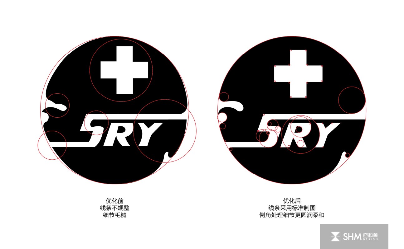
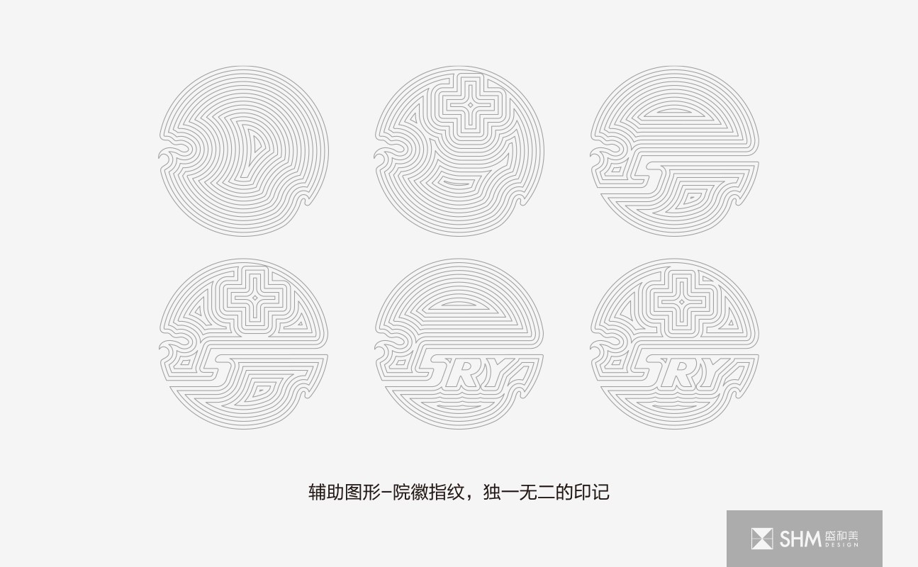
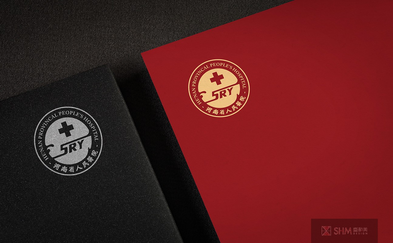
標志造型為一只展翅的鴿子,寓意帶來福音,灑下安寧與幸福,“SRY”是“省人醫”首字母,也是省人醫的專屬印記,“+”表明了救死扶傷的職業操守;輪廓為圓形,細節也進行了倒圓角處理,代表著安全與圓滿,寄托希望患者能相信省人醫的專業性,讓患者早日康復與家人團聚的美好祝福。紅色是中國的國色,從省人醫百年櫛風沐雨、砥礪前行的深厚歷史文化積淀中提取出“省醫紅”,代表著省人醫高度的權威性與嚴謹性;紅色也是血液的顏色,是醫療工作者心懷滿腔熱血病魔奮戰的剪影,代表著省人醫為患者無私奉獻的醫學精神。
The logo is a pigeon spreading its wings, which means bringing good news and spreading peace and happiness. "SRY" is the initials of "Provincial People's medicine", and also the exclusive mark of Provincial People's medicine. "Plus" indicates the professional ethics of saving the dead and helping the wounded; the outline is round, and the details are rounded, which represents safety and completeness. The hope is that the patients can believe in the professionalism of Provincial People's medicine, so that the patients can be early Good wishes for recovery and family reunion. Red is the national color of China, and "provincial medical red" is extracted from the profound historical and cultural accumulation of Provincial People's medicine, which represents the high authority and preciseness of Provincial People's medicine; red is also the color of blood, which is the silhouette of medical workers' heart full of blood and disease, and represents the medical spirit of Provincial People's medicine for patients' selfless dedication.
導視標識設計 / 品牌形象設計 - 醫療系統 - 河南鄭州

掃碼關注盛和美公眾平臺