請問有什么可以幫助您?
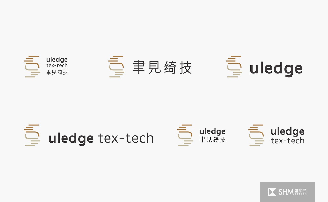
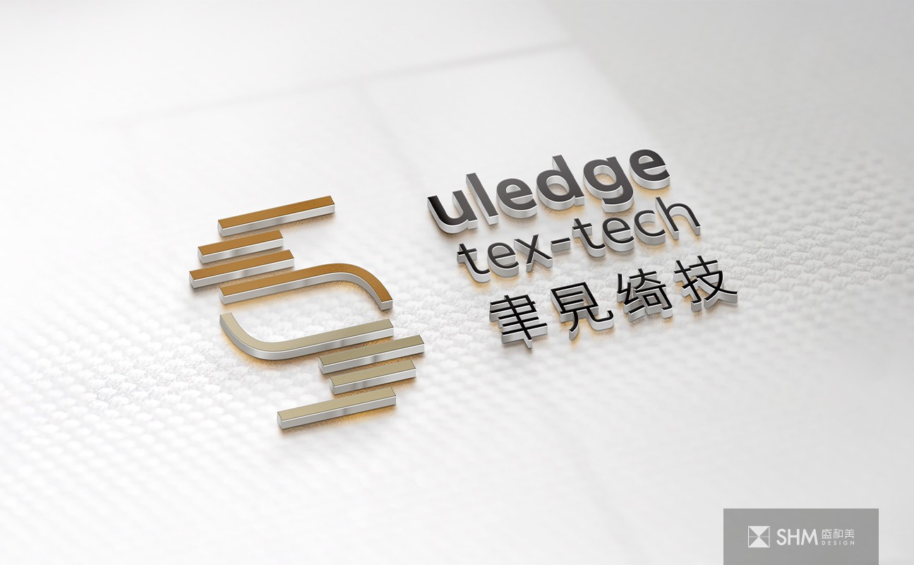
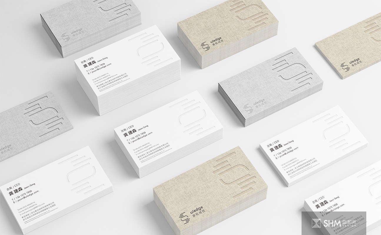
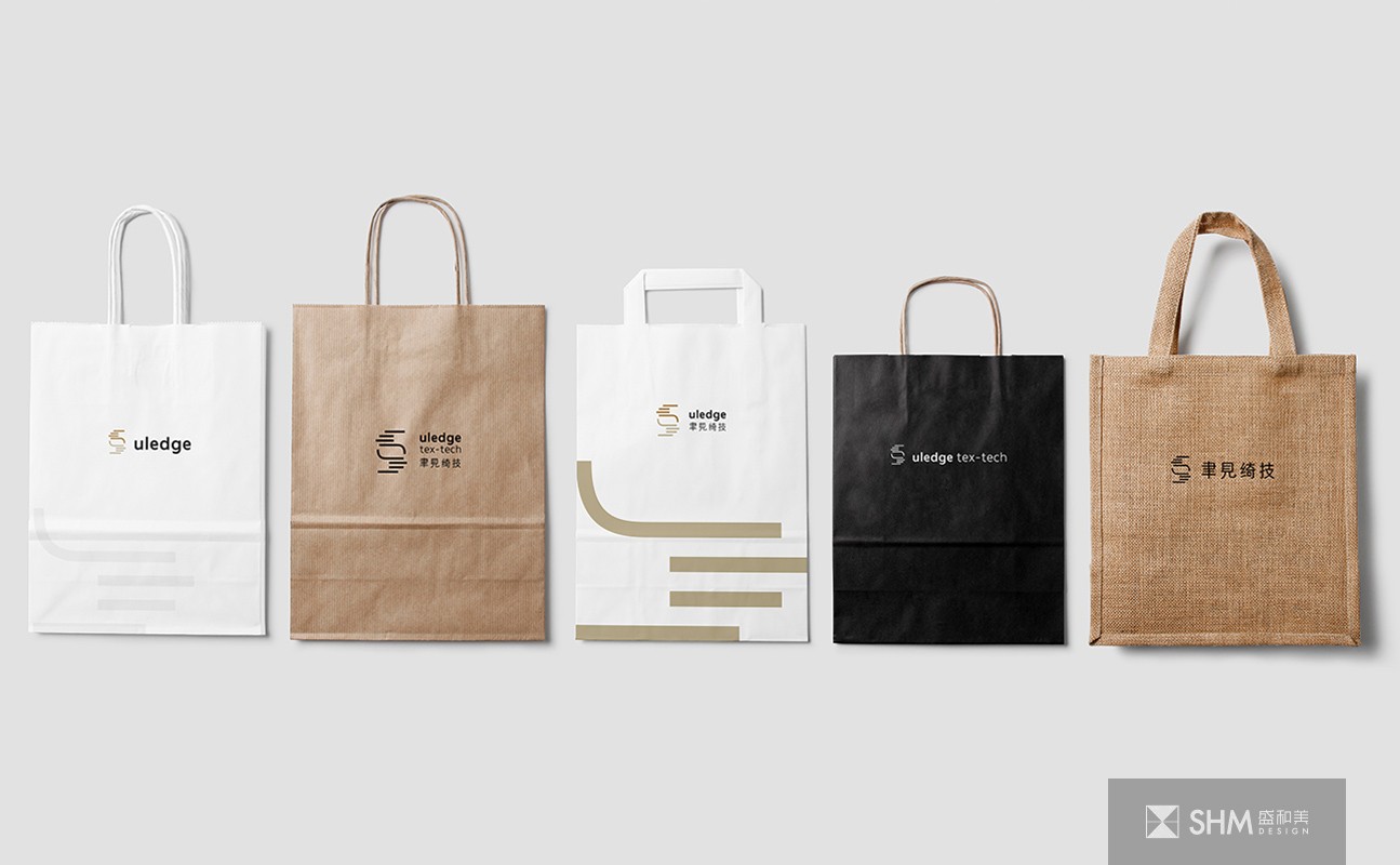
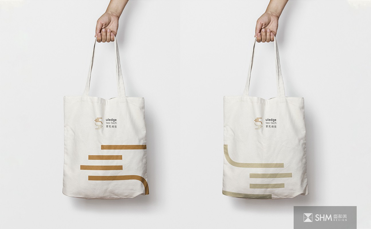
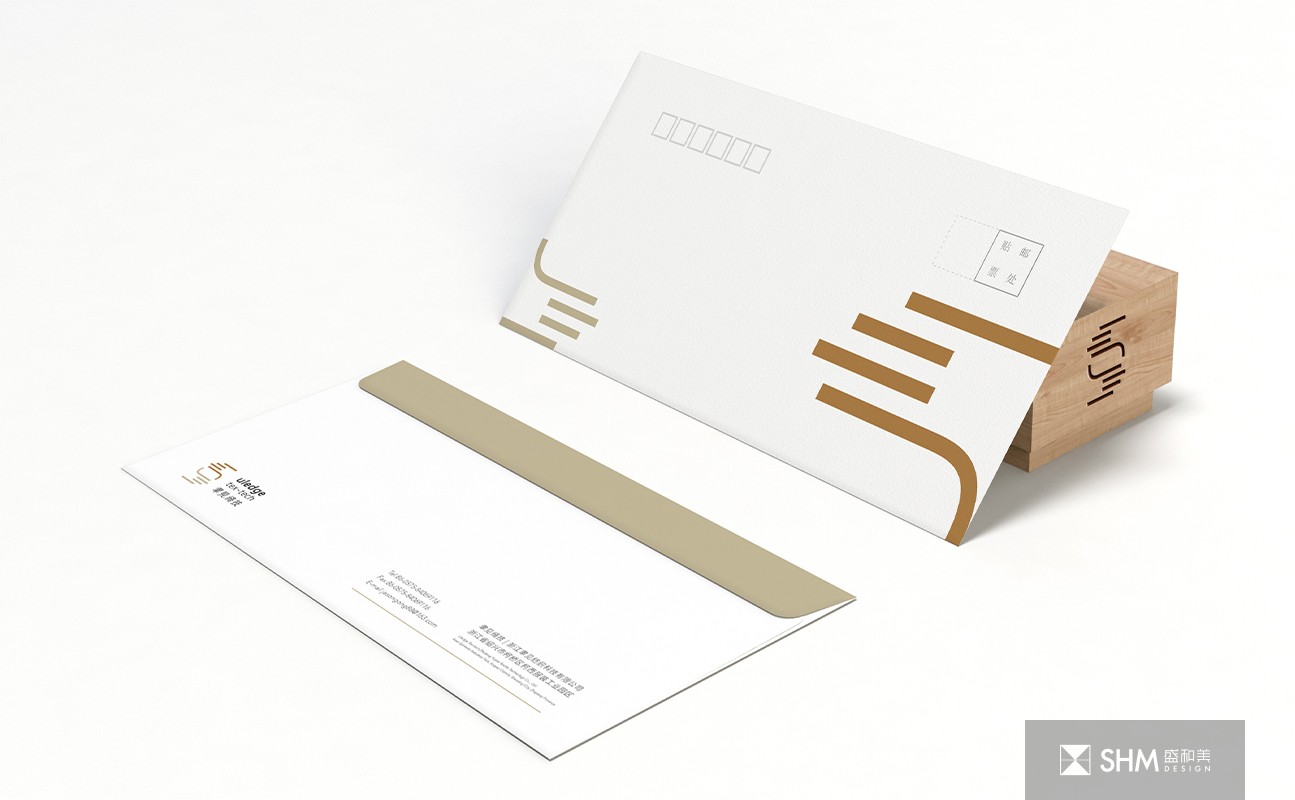
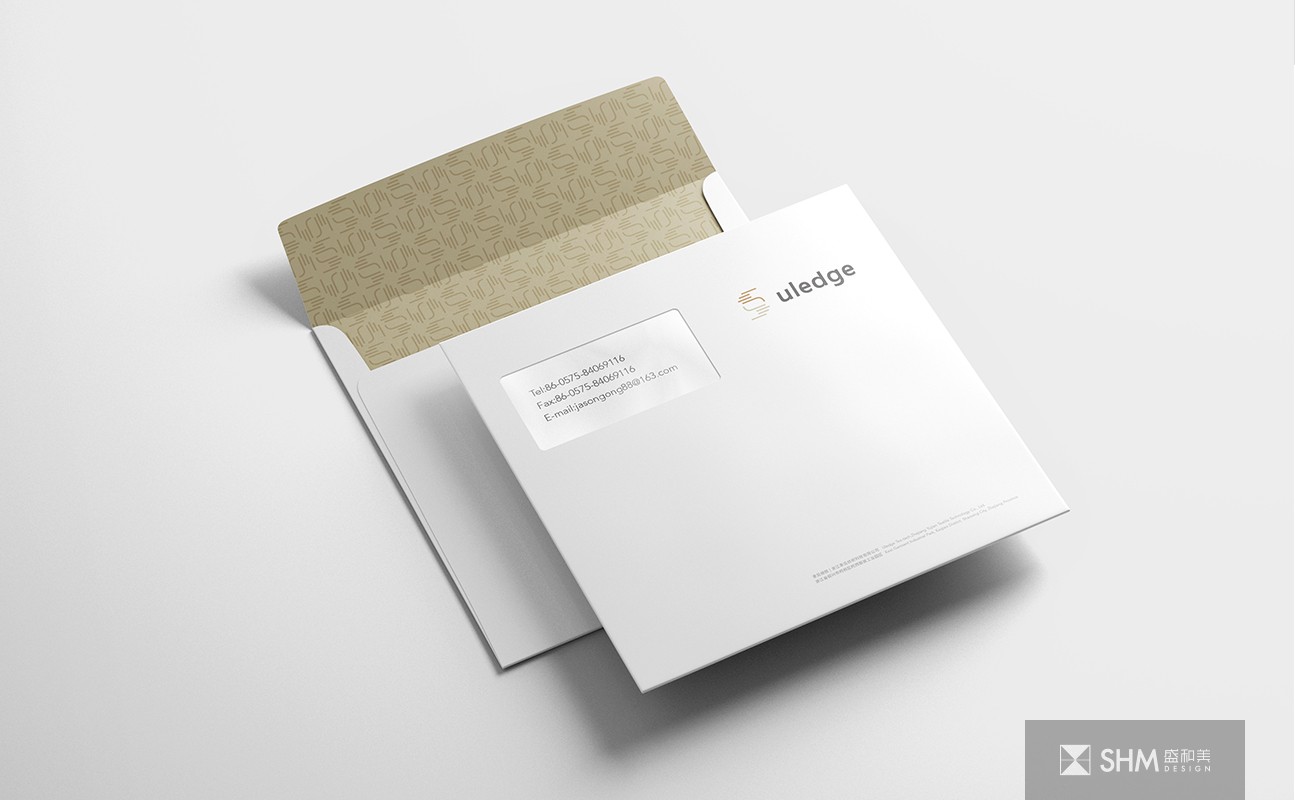
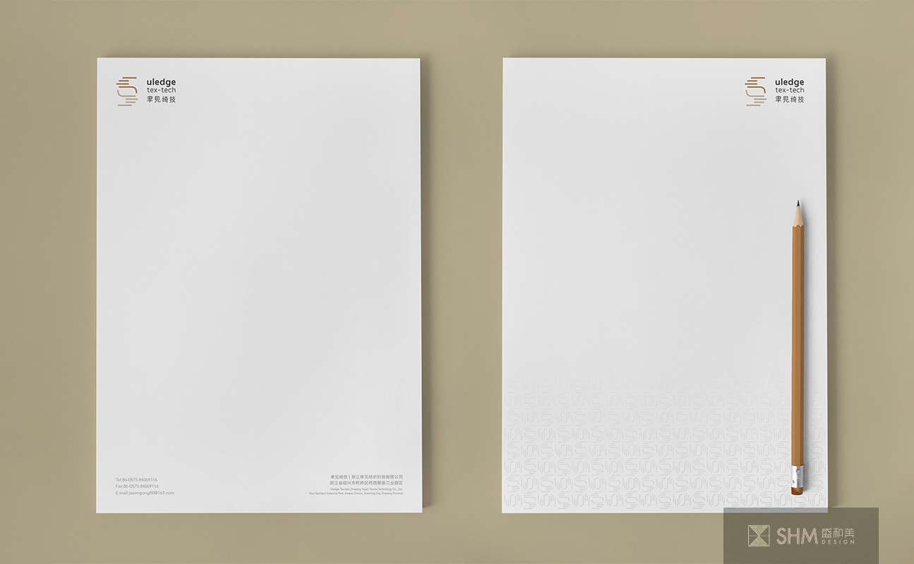
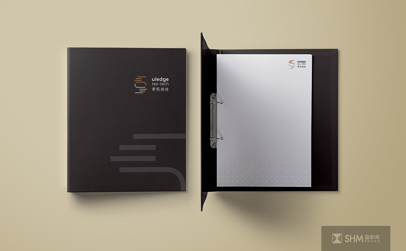
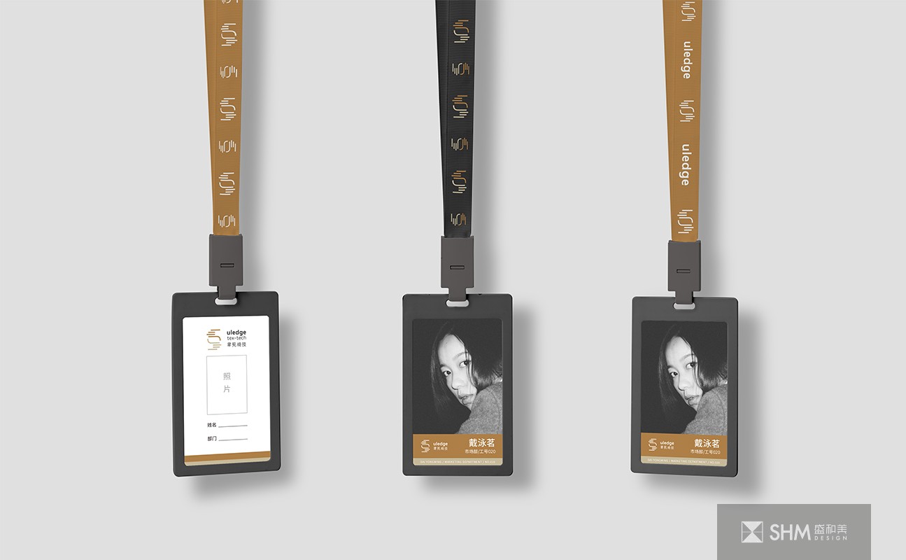
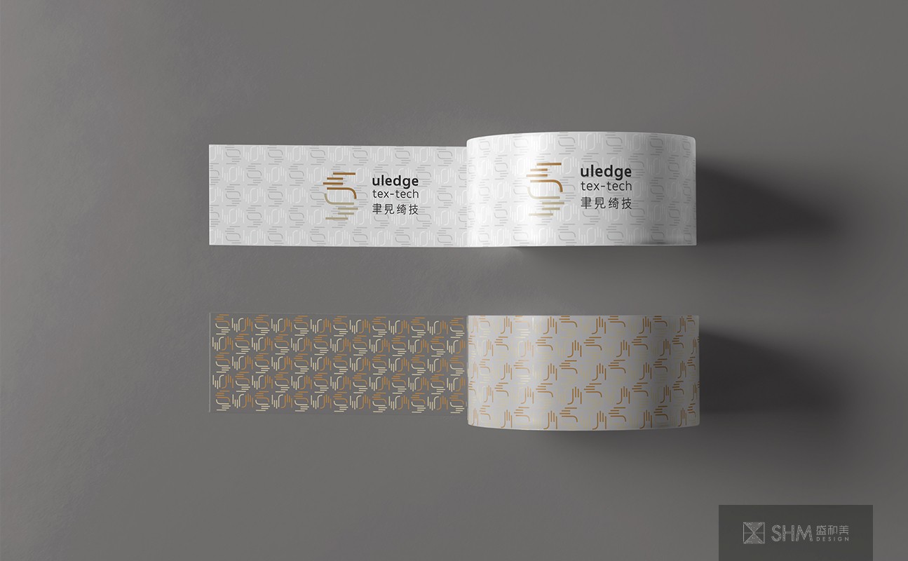
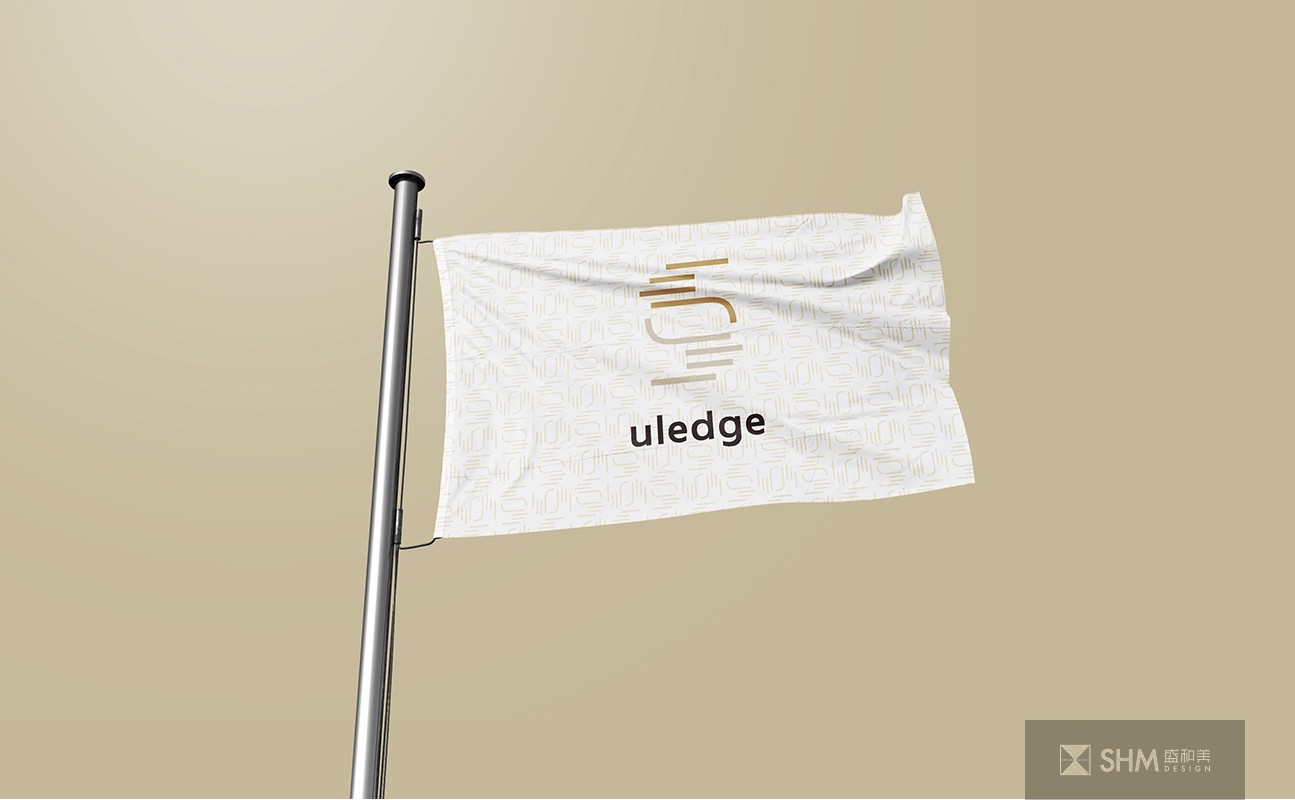
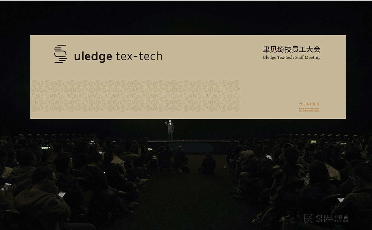
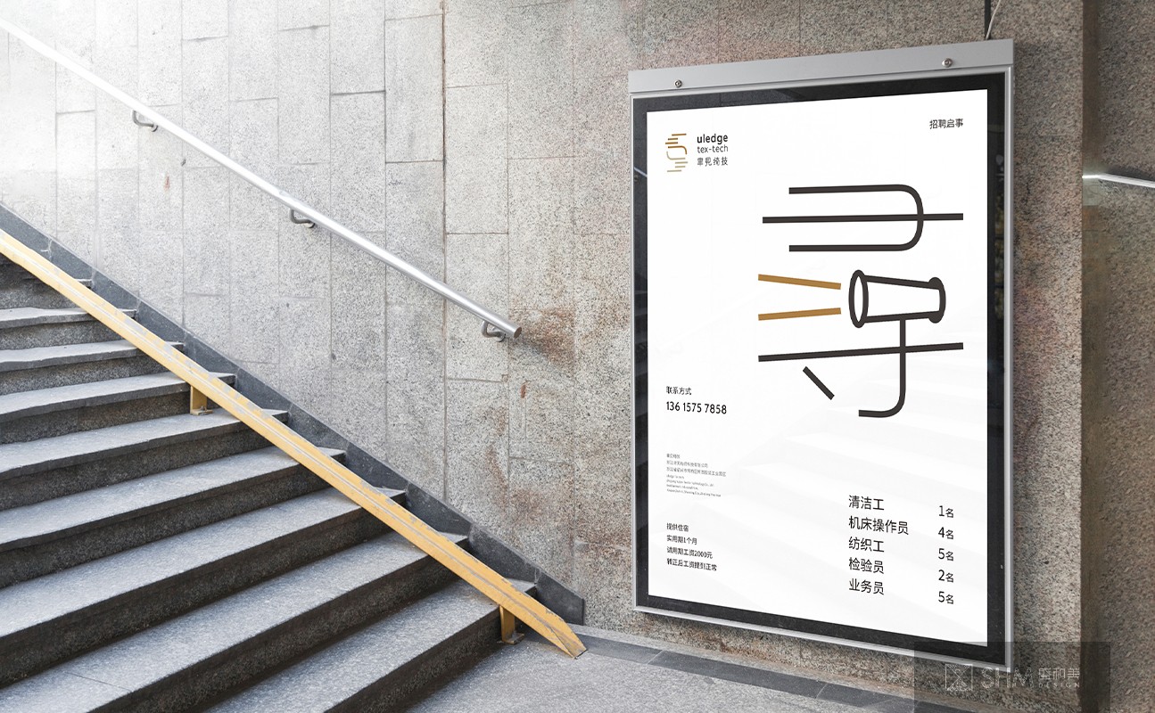
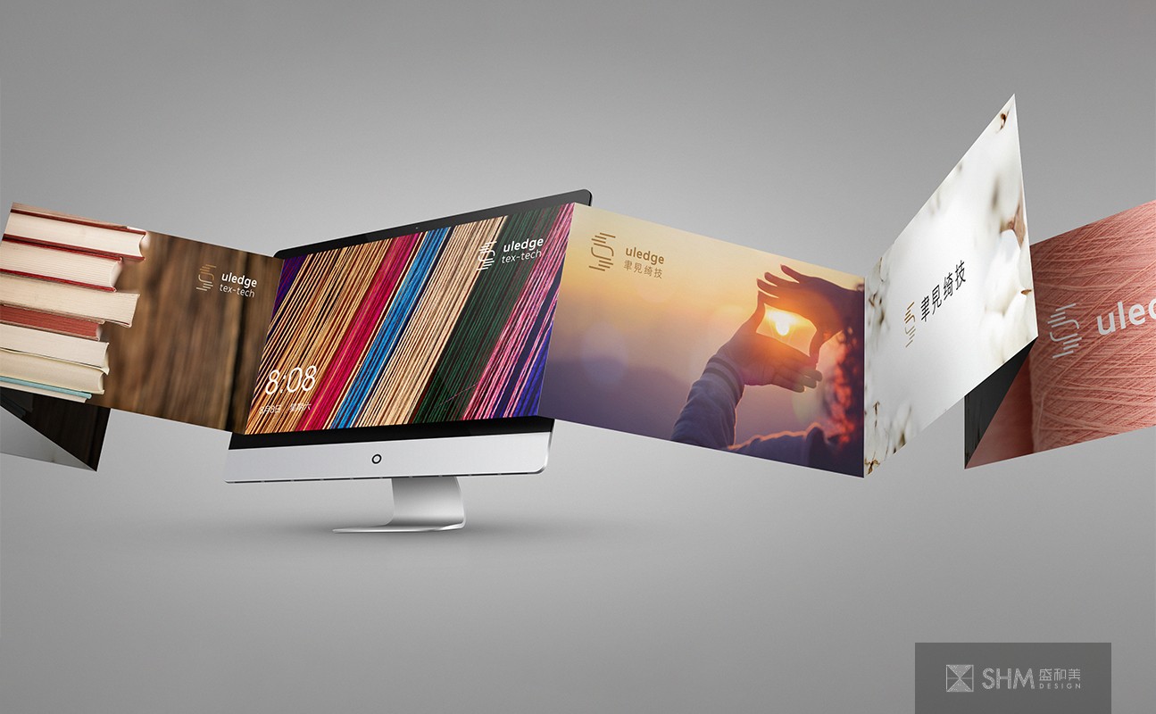
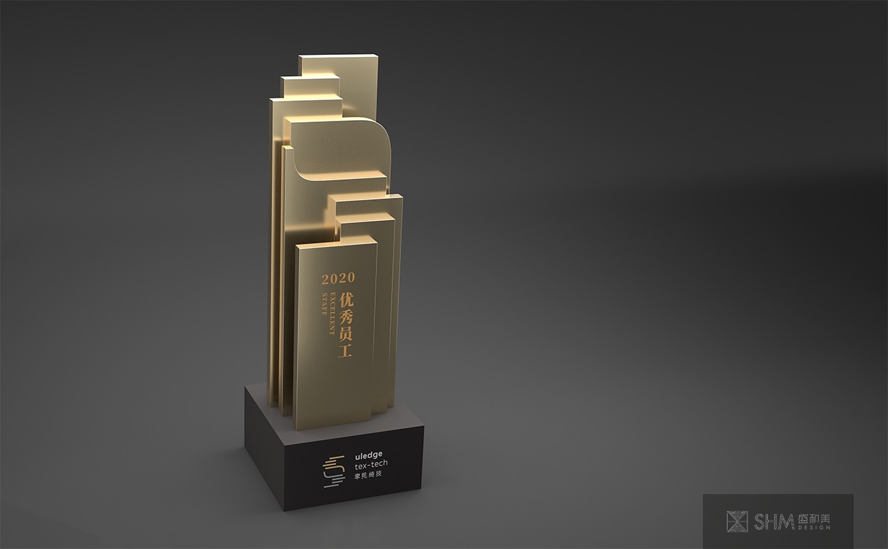
聿見綺技
uledge tex-tech
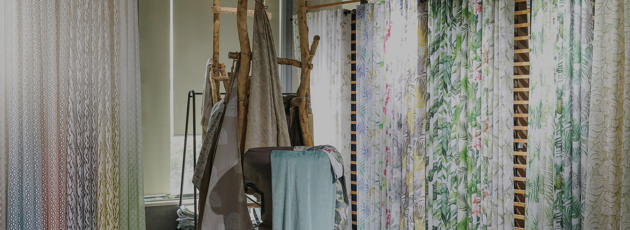
公司位于柯橋區柯西服裝工業園區,緊鄰104國道,離柯橋輕紡城僅幾分鐘車程,地理位置十分優越。公司主要生產窗簾、靠墊、床上用品等,產品遠銷歐美各國。自成立來,公司堅持走“以市場為導向,不斷自主創新”的發展之路。
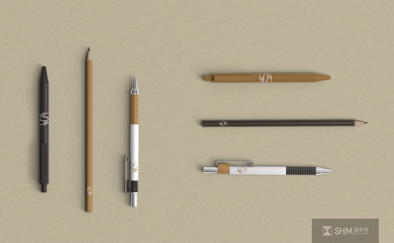
整個VI圍繞著雙手取景,構成企業標志的設計靈感,具有多重含義:一是代表聚焦、專注,是一種美學手勢;二是代表了手和眼,象征實干和遠見;三是仿佛轉動的紡織梭子,既代表了聿見綺技紡織的特性,又有互動交互、信息流的現代含義。一手向過去,一手向未來,源遠流長。色彩上采用兩種不同的棕色, 棕色常被聯想到泥土、大地、自然、簡樸,給人可靠、有益健康的感覺。
The company is located in Kexi Garment Industrial Park, Keqiao District, close to 104 national Road, only a few minutes drive from Keqiao textile City, the geographical position is very superior. The company mainly produces curtain, cushion, bedding and so on, the products are exported to Europe and America.
The whole VI revolves around both hands, forming the design inspiration of the corporate logo, with multiple meanings: one is on behalf of focus, concentration, is an aesthetic gesture; The second is to represent the hand and eye, a symbol of practical and far-sighted; The third is the spinning shuttle, which not only represents the characteristics of lut see excellent textile technology, but also has the modern meaning of interactive interaction and information flow. One hand to the past, the other hand to the future, a long history. Two different brown colors are used. Brown is often associated with earth, earth, nature, simplicity, and gives people a feeling of reliability and good health.
導視標識設計/品牌形象設計 - 商業領域 - 浙江紹興
掃碼關注盛和美公眾平臺