請問有什么可以幫助您?

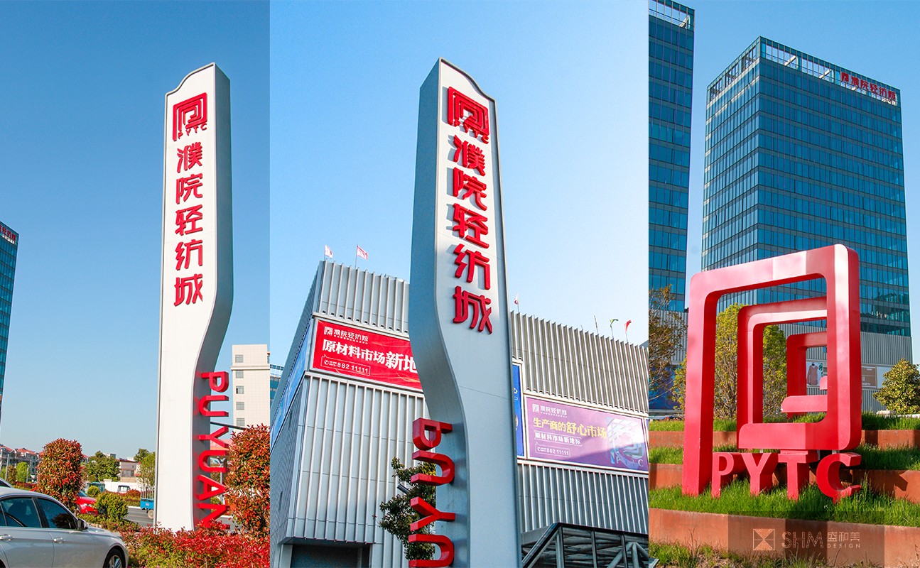
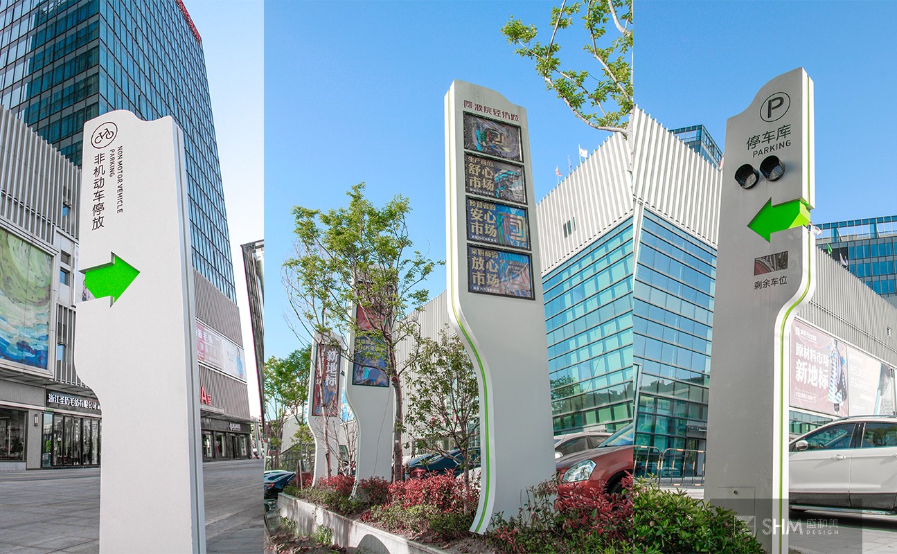
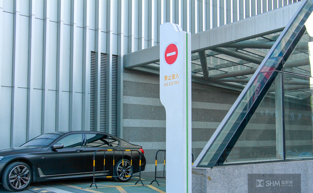
桐鄉濮院輕紡城
Tongxiang Puyuan Textile City
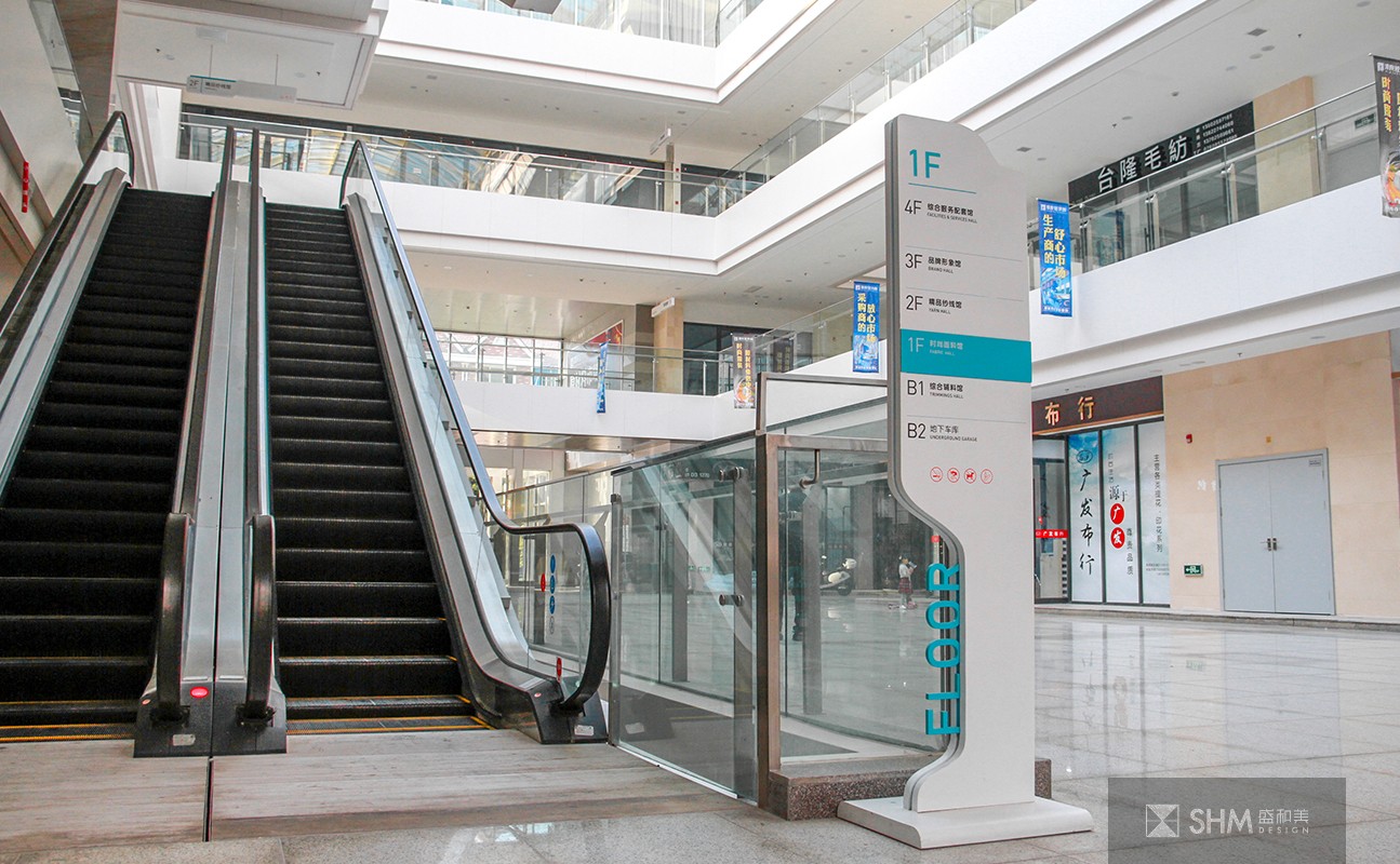
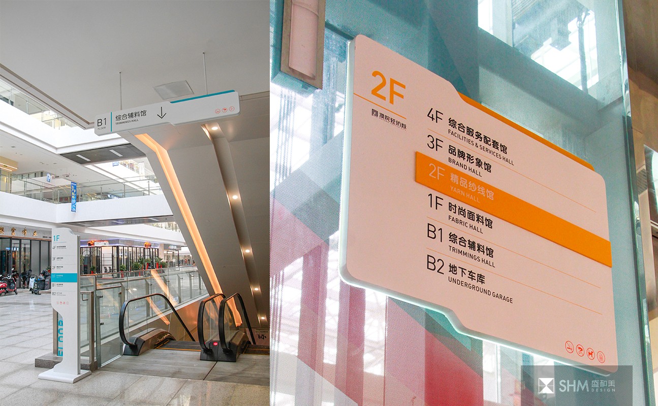
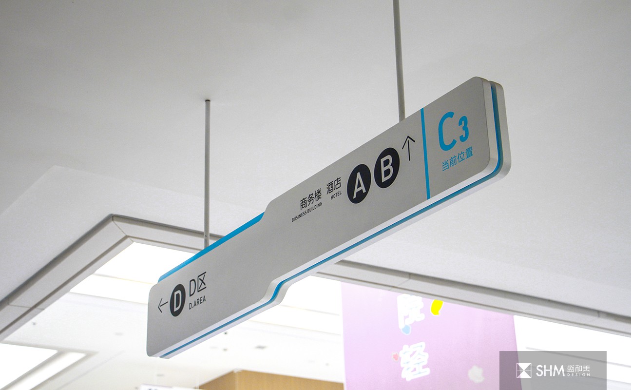
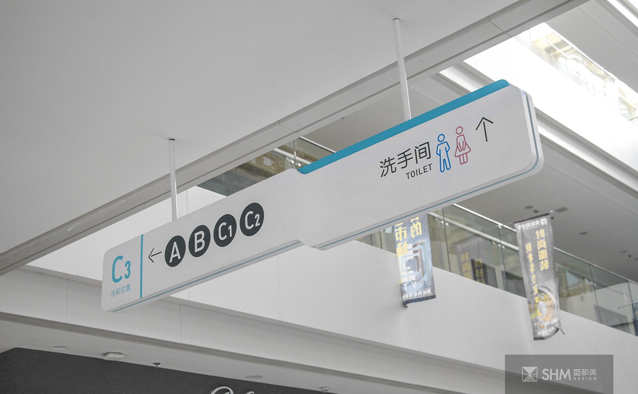
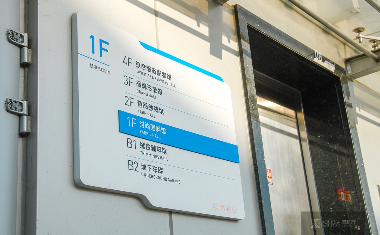
濮院輕紡城力是浙江省重點建設項目,求打造“全球針紡原材料集散中心”。我們在為其打造標識系統時,考慮到了它的現代化,采用了清晰柔和的綠色色調和局部橙黃色,搭配白色的底色,確保了在明亮的室內設計中具有非常好的辨識度以及遠距離效果。設計時,字體選擇了一種柔軟形狀的現代字體,并輔之一些清爽的箭頭等,以易讀性和實用性很好的貼合到架構中,在造型多變同時也達到了整體的連貫統一,為訪客打造了一個方便又清晰的現代導航系統。
In zhejiang province puyuan textile city force is a key construction project, and make "this raw materials distribution center in the world." When we are in for its identification system, consider to its modernization, the clear soft green color and local orange, tie-in white background, ensures that in the bright in interior design has the very good identification and effect over a long distance. Design, chose a soft font in the shape of modern font, and auxiliary one, such as some of relaxed arrow joint with very good readability and practicability to architecture, at the same time in the modelling changeable also reached a coherent whole, for visitors to create a convenient and clear the modern navigation system.
導視標識設計 - 商業領域 - 浙江嘉興
掃碼關注盛和美公眾平臺